Improving the store finder experience by adding service-based filters
Introduction: The Walmart app is constantly evolving, and during the transition from one design system to another, some important features can be overlooked. Our role was to ensure feature parity and maintain a consistent, seamless experience across the app.
Role: UX/UI Designer
Industry: Retail
Duration: Q1-Q2 2024
Tools: Figma, Figjam, Jira, Confluence
Understanding the context & userflow

Walmart is a multi-service retailer, and when its customers go directly to buy what they need, they need to know which of its various store types to go to.
The problem
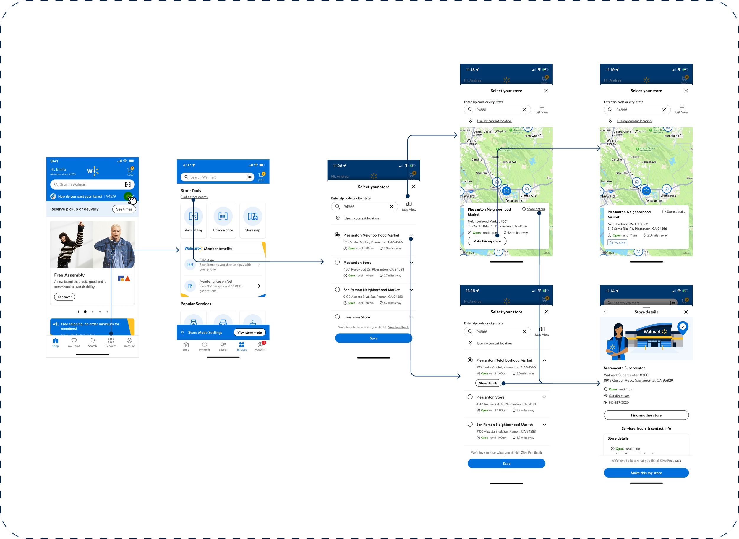
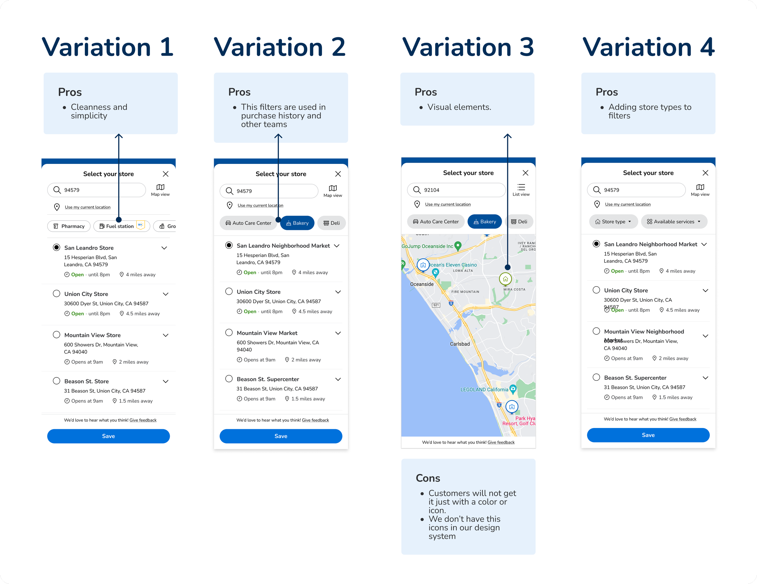
When we moved everything to the new design system some features didn’t get moved to the app, in this case, filters in the store finder where not implemented. We need to bring parity to the app experience.
We are indicating in the store list whenever the store is a neighborhood market or a supercenter, However, that differentiation is not shown in the map.

“I want to buy some plants for my apartment, but I don't know which of the Walmart stores has a garden center, so I have to go to any one and hope to get lucky.”
The goal
Help customers discover Walmart stores at their preferred location to feel more confident to plan their visits to their community stores.
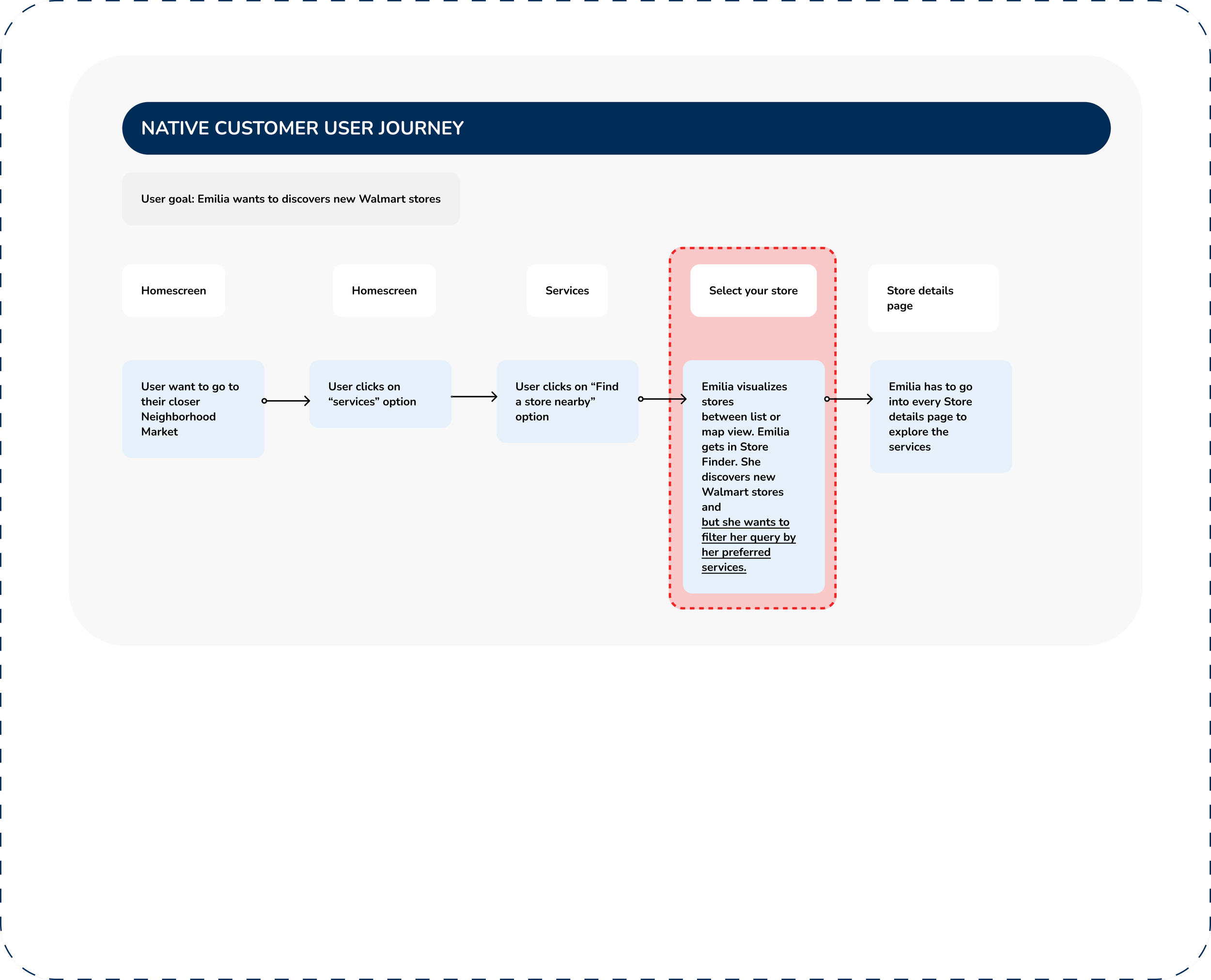
Exploring the experience across different platforms
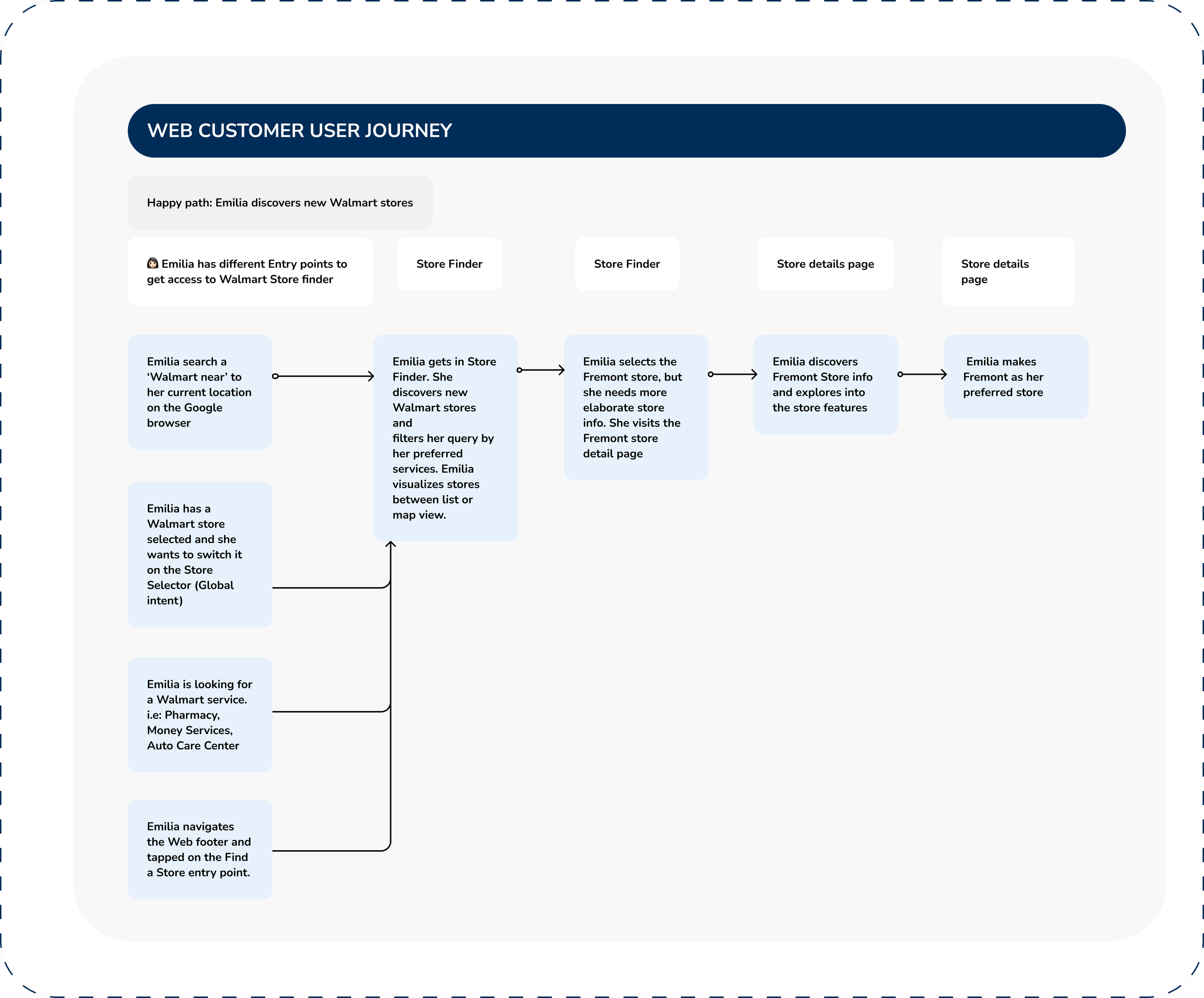

As Emilia is a customer with a selected store by GEO, she has the opportunity to discover Walmart store through Web experience
Finding:
Currently, customers can filter by store type and navigate to their nearest specific store on both web desktop and mobile platforms.
The proposed solution
Allow customers to filter by Auto Car Center, Bakery, Deli, Pharmacy, Gas station, money services, vision center, photo center, grocery, Walmart health, garden center, and wireless services
Update Walmart store icons to indicate neighborhood markets/supercenters
User flows
Reviews needed to deliver to development.


2. Design team review
Iterations based on all design systems
3. Leadership review
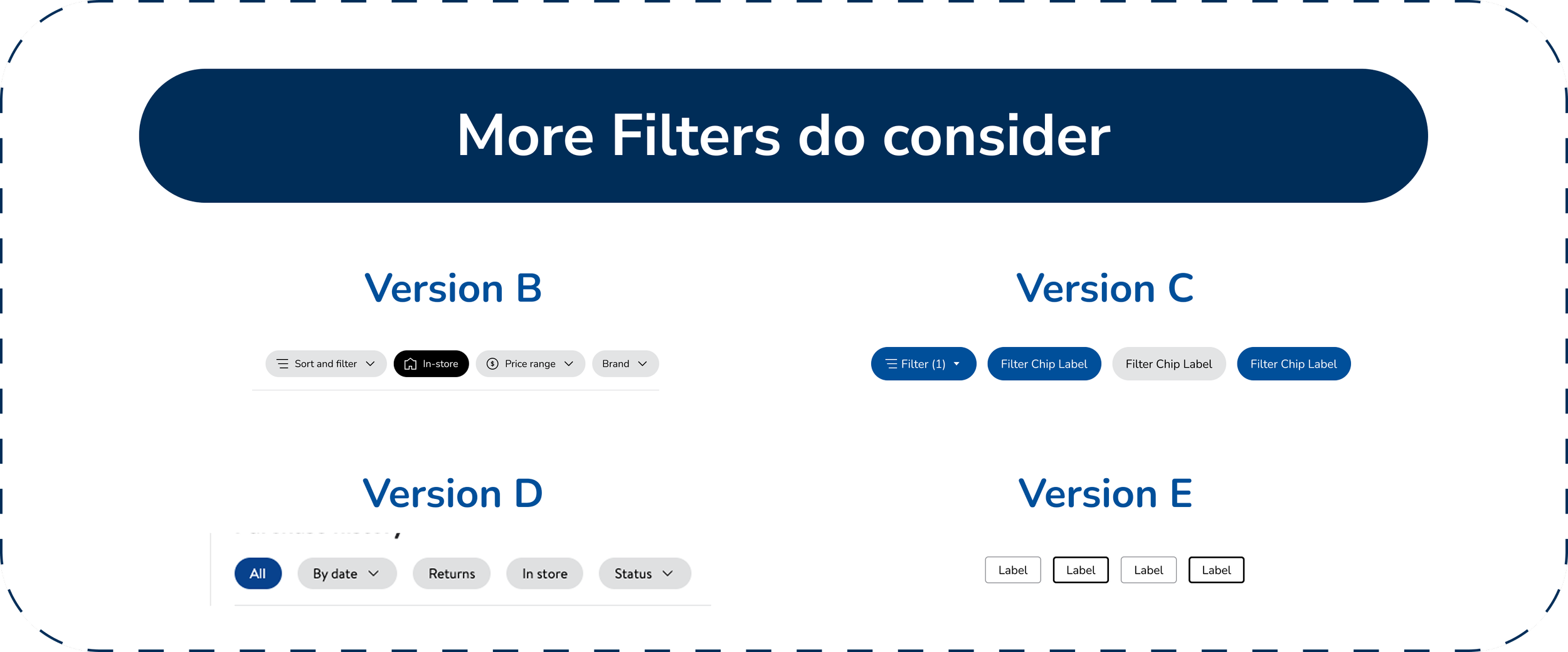
But, what about Accessibility…?
ADA: We should have just 1 general dropdown to avoid carrusel

Having just 1 general dropdown to avoid carrusel
The dropdown includes store type and store services options
The 2 lists are opened by default
Options are listed in alphabetical order
If user selects a store type that doesn’t offer all store services, then these services not offered need to be removed. And vice versa.
The map gets filtered by the options selected on the filter list.
Is this the ideal experience? Users have other pain points
Should we expand the scope?
Findings

Final designs based on Heuristics
Success metrics
Error rate for “find a store nearby” reduced on 20%
Time on task for “get directions” reduced on 44%
What I learned
Even if we want to stay aligned with our pre-existing design systems, accessibility will always take precedence over anything else in decision-making.

When designing for platforms with multiple dependencies, communication across all teams is key. Networking with all colleagues is essential to ensuring we create designs that speak the same language across all platforms.